Final Logo (my picks)

Discuss, get help with, or post new graphics for TTDPatch and OpenTTD, using the NewGRF system, here. Graphics for plain TTD also acceptable here.

Moderator: Graphics Moderators

User avatar
SkeedR
Tycoon
Tycoon
Posts: 2267
Joined: 11 Jul 2004 14:55
Location: West Midlands
Contact:

Post by SkeedR »

tuisu wrote:...... First, I prefer the full colour one over the yellow/black variant because the later one makes me feel like the world is on fire and the land is all burnt. OpenTTD is not a strategy war game as far as I know :) ......
It has all been desertificated. :(
Last known as: Weirdy
User avatar
Benbo
Transport Coordinator
Posts: 380
Joined: 09 Jan 2006 18:51
Location: UK

Re: Final Logo (my picks)

Post by Benbo »

DaleStan wrote:Benbo:
Alltaken wrote:Black/White (for photocopying or top of B/W documents)
Yes but as Alltaken has just said, no-one would use it. It just gives a dim impression IMO.
User avatar
proudmoore
Director
Director
Posts: 575
Joined: 01 Jun 2005 18:07

Post by proudmoore »

|Go for the black andgold one all the way.It'll reflect what the world'll be like by 2090 with all these bloody tycoons filling in the lakes and slaughtering trees everywhere!
For Knowledge, Civilisation, and Chocolate Waffles!
User avatar
Red*Star
Transport Coordinator
Posts: 355
Joined: 12 Nov 2005 19:46
Location: Germany
Contact:

Post by Red*Star »

Got your bad day today, eh?

;)
User avatar
proudmoore
Director
Director
Posts: 575
Joined: 01 Jun 2005 18:07

Post by proudmoore »

have you seen what some of my friends get up to in ottd - entire forests wiped out, power stations everywhere, and the odd nuked site - continually deleting them...

Don't tell me you don;t do this sort of thing... Everyone has to wipe the odd forest...
For Knowledge, Civilisation, and Chocolate Waffles!
User avatar
Red*Star
Transport Coordinator
Posts: 355
Joined: 12 Nov 2005 19:46
Location: Germany
Contact:

Post by Red*Star »

Oh, alright, you mean the game-world. I thought you meant the real world.
User avatar
proudmoore
Director
Director
Posts: 575
Joined: 01 Jun 2005 18:07

Post by proudmoore »

oh, i'm sure that'll be the same, but the game world'll be like that sooner...
For Knowledge, Civilisation, and Chocolate Waffles!
User avatar
Red*Star
Transport Coordinator
Posts: 355
Joined: 12 Nov 2005 19:46
Location: Germany
Contact:

Post by Red*Star »

Great, another one without any hope. *rolleyes*
I would say: We could never know what the future brings.

But sorry for talking offtopic.
worldofklaus
Engineer
Engineer
Posts: 119
Joined: 09 May 2004 18:40
Location: Munich, Bavaria
Contact:

Post by worldofklaus »

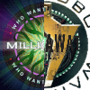
I'd go for the blue / white one. IMO full-color is too "crammed" with color; imagine it in the normal Mac OS List view, Image it would just look crappy in this scale. The yellow / black loooks simply repulsive, and the B/W one is pretty boring.
Yet still, they're all better than the current Logo...
User avatar
WWTBAM
Moderator
Moderator
Posts: 3689
Joined: 02 Apr 2005 07:01
Location: Sydney NSW Antipodea
Contact:

Post by WWTBAM »

i like the current logo most but then full colour.
Alltaken
Tycoon
Tycoon
Posts: 1285
Joined: 03 Dec 2003 06:24
Location: Christchurch, New Zealand
Contact:

Post by Alltaken »

I am all for the existing "Icon" to stay.

The logo and the clickable icon need not be the same

for larger resolutions like on Mac's and such, then the logo is good, but i still like the icon.

Alltaken
Post Reply

Return to “Graphics Development”

Who is online

Users browsing this forum: Ahrefs [Bot], Google [Bot] and 47 guests