Okay. Okay. You win TrueLight. I'm sorry I tried to make the world a better place by posting something that was mildly humorous.

Anyway, here's my two cents.
Penny #1) The OpenTTD.org frontpage and links all look good. They are all functional, simple, and in a 21st century, very open-source project way, it is actually not a bad design; in fact, it looks sorta hip and fresh in an urban cyber-punk way. I don't know if you want to reposition the buttons and everything. My advice, if this is what you want, is that you shouldn't change the layout at all. If you want to change some of the graphics, that's fine, but don't get too fancy. This isn't a surrealist exhibit. Maybe, just maybe, you could change the color scheme around a little bit and put a new graphic on the title banner, instead of the desaturated city scape. Change the font? Yes? No? As long as it's not f*cking wingdings and it's not Vivaldi or Ravie, honestly it's not a big deal. Have the lighthouse on the "download the newest version" link change. Have it be a plane or a train engine or a radio tower or Godzilla in the morning when he hasn't had his coffee yet (hey, there's a good disaster idea). I just took a look at the old (previous website) design and it's really the same. They made the smallest changes, they fooled around with the font, and colors and title banner, they made the new website one where the text box doesn't spread all the way across the screen on larger resolutions.
Penny #2) If anything is redesigned, it really should be the forums. I presume the forums aren't run by the same people who run openttd.org. The Yellow on grey is not terrible, and the grey on green is bearable. But put blue on grey on green with yellow text and it really starts to look pretty much like what Ralph said: a
bad throwback to the early 90's, back when websites and homepages looked terrible, blogs didn't exist, and the only people who owned websites were nerds. LETS PLAY WITH COLORS!! (This is what you say to a hot color at the bar: Hey gorgeous. Can I buy you a drink? Maybe you could give me your RGB numbers, eh?) AHAHAHA SO FUNNY
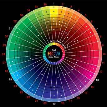
Okay. So, my conclusion is: If you want to do design work really badly, the biggest improvement would be to get together with the admin of these forums so they can experiment with the color scheme a little bit. Choose one primary color and some whites or blacks and some different shades of that primary color. Or take two colors that are on opposite sides of the color wheel, like tealish and maroonish (but don't actually choose those specific colors for these forums). Or do something that makes it seem like the person setting the appearance of these forums actually has properly functioning retinas.
See:
http://www.realcolorwheel.com/colorwhee ... el_475.jpg
for reference. Very middle school, but, you know, if your education system sucks like the one in my country (compared to other DEVELOPED countries) and you also live in a culture that encourages stupidity, irrationalism, ignorance and anti-intellectualism (TEE HEE, BEING STUPID IS FUNNY AND CUTE), like I do, then you may have never heard of the color wheel.
Anyway. That is my two cents. Please don't delete this, since I really have taken pains to make it on topic.
On a side note: If you're really desperate to get someone to do design work, I would just throw it at someone and force them to do it. I've never met anybody who couldn't slap together a website template if a knife was to their throat.
-=Vox=-


