d00mh4mm3r wrote:sweet as dude.
add a mail box (the blue ones) out front, and a news-stand and its all set
nahhh add a red telephone booth
Funny, I didn't read d00mh4mm3r's post, and when I read your suggestion to add a phone booth, my first thought was 'nah, not a phonebooth, add a mailbox'.
'Twas only after that that I noticed that's what d00mh4mm3r suggested
GoneWacko. Making [url=irc://irc.oftc.net/tycoon]#tycoon[/url] sexy and exciting since 1784.
ahh, now thats one cool building right there. if people where realy fussy i guess, satelite dish's on the roof, a safty rail on the roof as well would be asked for, but I say its cool for TTD right now:D
Sorry, but it looks too... cubic? It does not look like a building, but like a simple 3D model. TTD graphics were much more alive. I suppose the contrast is the problem. The image should be much more contrast.
Allthough the original ttd graphics contain some buildings with rather distinguised architecture, there are also lots of buildings that are fairly basic in style as well as detailing.
dmh_mac wrote:Allthough the original ttd graphics contain some buildings with rather distinguised architecture, there are also lots of buildings that are fairly basic in style as well as detailing.
Yes, but they look more alive, because, I suppose, of the contrast. Try to render you building to be more contrast and post here. We shall look, if my supposition correct.
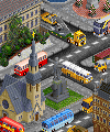
cityscape1.jpg = how it is now
cityscape2.jpg = increased saturisation and contrast
You probably prefer 2.
I don't, since I'm not going for the cartoony oversaturated look of ttd (which is fine in it's own right), but for semi realistic city colours and lighting.
dmh_mac wrote:A small mockup.
cityscape1.jpg = how it is now
cityscape2.jpg = increased saturisation and contrast
You probably prefer 2.
I do. Lets make a poll?
BTW, the garden is enought contrast in the 1 image
dmh_mac wrote:I don't, since I'm not going for the cartoony oversaturated look of ttd (which is fine in it's own right), but for semi realistic city colours and lighting.
One more idea - try to change the windows' texture. Now it looks like a paper
Last edited by George on 22 Jul 2005 10:36, edited 1 time in total.
I say number two, even though I would prefer number one. Why? With 32bit, I see tinting and other effects as being a real possibility. So having somthing that looks bright and cheerful at first, will be a good start.
Number two looks more TTD'ish aswell. Bright, warm, lively.