Page 5 of 6
Re: 32 BPP screenshots.
Posted: 20 Jan 2010 23:38
by neob
damn almost, i am missing 2 sprites, here the best i could do:
Re: 32 BPP screenshots.
Posted: 20 Jan 2010 23:42
by petert
Part of the track is monorail, did you do that on purpose?

Re: 32 BPP screenshots.
Posted: 20 Jan 2010 23:51
by neob
yes i am missing the monorail crossing sprite (btw the monorail tracks are beautiful)
and the other one was the monorail good wagon... so yes ...
i could do some editing in photoshop but i prefer to wait and for the appropriate sprites to be finished and let the work speak for it self.
Re: 32 BPP screenshots.
Posted: 21 Jan 2010 12:25
by SHADOW-XIII
omg, those shots looks soooo nice ...
Re: 32 BPP screenshots.
Posted: 21 Jan 2010 13:11
by maquinista
neob wrote:yes i am missing the monorail crossing sprite (btw the monorail tracks are beautiful)
and the other one was the monorail good wagon... so yes ...
i could do some editing in photoshop but i prefer to wait and for the appropriate sprites to be finished and let the work speak for it self.
The problem is that the monorail crossings are not modelled.
Re: 32 BPP screenshots.
Posted: 21 Jan 2010 15:21
by Ben_Robbins_
neob: I think this calls for some photoshopping until the real sprites are made. Try overlaying this. Also I notice that the railway crossings have the incorrect road sprites. I'll edit them and upload in the graphics section.
(I would have assembled it but you've attached a .jpg, so would need to completely reassemble the image myself.
Re: 32 BPP screenshots.
Posted: 21 Jan 2010 16:00
by CommanderZ
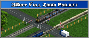
neob's logo
That really does look good. A lot!
Re: 32 BPP screenshots.
Posted: 21 Jan 2010 16:17
by neob
i attach a jpg because i dont have photoshop, my paint.net makes my PNGs 3MB large and my crappy wifi disagree with that kind of abuse.
anyway nice work as always, i am attaching the file here because i cannot make this quality of work myself.
damn it i googled the pain.net PDN format and its not supported in photoshop, so i saved each layer in a different png.
have fun (and may be you can get rid of that ugly stretched frame

)
Re: 32 BPP screenshots.
Posted: 21 Jan 2010 16:38
by Ben_Robbins_
If you save a png from paint.net and then go to the properties of that file in windows, and go to the summary; is its 'Bit depth - 24'? If not then when you save in paint.net and it brings up the options, make sure you set it to 32bpp (24bit and alpha). Otherwise your using the space required for far higher variations of colour for images that won't use it.
Re: 32 BPP screenshots.
Posted: 23 Jan 2010 17:54
by 32Bpp-Pack
i love it
, i hope you dont mind that i butchered it a bit to make it fit as a signature

- 32bpp signature.png (72.61 KiB) Viewed 2863 times
Re: 32 BPP screenshots.
Posted: 23 Jan 2010 22:26
by maquinista
Looks good, but I prefer the railway fences by Varivar. I don't know if he has released all the sprites.
Re: 32 BPP screenshots.
Posted: 23 Jan 2010 22:53
by colossal404
I like these 32BPP screenshots, but what are these pillars? Why aren't the rail continous?
Re: 32 BPP screenshots.
Posted: 24 Jan 2010 01:41
by maquinista
colossal404 wrote:I like these 32BPP screenshots, but what are these pillars? Why aren't the rail continous?
Because the It is constructed in sections.

The reason was that crossings would look strange with a continuous rail.
Re: 32 BPP screenshots.
Posted: 25 Jan 2010 13:20
by Ben_Robbins_
colossal404: Personally I think it's a really good idea. Modular building, just as it is in game, and it gets rid of the key graphical glitches as maquinista said.
32Bpp-Pack: Feel free to use it as you want.
maquinista: I agree with you on the fencing, they do stand out. I've made some new ones, working off that set. (Blend Thread).
Re: 32 BPP screenshots.
Posted: 27 Jan 2010 22:29
by Roujin
Nice effort. I only think that the caption "32bpp full zoom project" is too hard to read.. maybe try another font?
Re: 32 BPP screenshots.
Posted: 28 Jan 2010 01:22
by petert
Roujin wrote:maybe try another font?
Since you are basing that logo off the
tt-forums logo, I suggest you use the same font as the tt-forums logo, perhaps orudge can tell us what that might be.
Re: 32 BPP screenshots.
Posted: 28 Jan 2010 08:25
by CommanderZ
I think some common smooth font should be ussed - since the 32bpp graphics are unlike the original graphics not pixellated.
Re: 32 BPP screenshots.
Posted: 28 Jan 2010 16:25
by neob
i like this one and 'petert' by all mean not the original font not in this size.
Re: 32 BPP screenshots.
Posted: 28 Jan 2010 19:23
by maquinista
I like the current font. It's only a logo, not a generic text.
Re: 32 BPP screenshots.
Posted: 04 Feb 2010 15:18
by Ben_Robbins_
Updated, I didn't change the font, but I removed a few black spots for easier reading. The justification: it's a bit block like the originals and TTD in general, but then slightly more querky/modern as the project should be and is. Updated the fence and track, and I've tweaked the monorail and side of the lorry...maybe I'll adapt them one day.