Time To Expand Station Purchase Window?
Moderator: TTDPatch Moderators
looks cool.
Formerly known as r0b0t_b0y2003, robotboy, roboboy and beclawat. The best place to get the most recent nightly builds of TTDPatch is: http://roboboy.users.tt-forums.net/TTDPatch/nightlies/

cool!eis_os wrote:I guess you look like this now:
TT-Screenshot Of The Month - 2012 July, winner!
TT-Screenshot Of The Month - 2013 May, winner tie with Purno!
TT-Screenshot Of The Month - 2014 February, winner!
TT-Screenshot Of The Month - 2014 June, winner tie with alluke!
TT-Screenshot Of The Month - 2014 April, winner!
My screen shot thread ---> Have a look
TT-Screenshot Of The Month - 2013 May, winner tie with Purno!
TT-Screenshot Of The Month - 2014 February, winner!
TT-Screenshot Of The Month - 2014 June, winner tie with alluke!
TT-Screenshot Of The Month - 2014 April, winner!
My screen shot thread ---> Have a look

Hmm I'm unsure whether I like this or not.
It's a really nice feature, with the graphics and all, but I dunno - something about it makes me not like it so much. Possibly how much space it's taking up.
It might grow on me. Cool work tho, as always, Oskar.
It's a really nice feature, with the graphics and all, but I dunno - something about it makes me not like it so much. Possibly how much space it's taking up.
It might grow on me. Cool work tho, as always, Oskar.
Official TT-Dave Fan Club
Dave's Screenshot Thread! - Albion: A fictional Britain
Flickr
Why be a song when you can be a symphony? r is a...
Dave's Screenshot Thread! - Albion: A fictional Britain
Flickr
Why be a song when you can be a symphony? r is a...
Cool, but I'm not sure I like it. Then again, I thought the same thing about the signal gui, and that definitely grew on me.
To get a good answer, ask a Smart Question. Similarly, if you want a bug fixed, write a Useful Bug Report. No TTDPatch crashlog? Then follow directions.
Projects: NFORenum (download) | PlaneSet (Website) | grfcodec (download) | grfdebug.log parser
Projects: NFORenum (download) | PlaneSet (Website) | grfcodec (download) | grfdebug.log parser
-
minime

- Transport Coordinator

- Posts: 339
- Joined: 18 Jan 2004 10:02
- Skype: dan.masek
- Location: Prague, Czech Republic
- Contact:
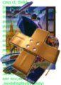
Would it be possible to center the text vertically in the cell and provide some kind of a separator between the cells? (See attached picture)
Another nice feature that comes to mind would be to allow the station GRF authors to provide a customized icon for this purpose (say by a special cargo ID (e.g. FD) in Action3, or a callback variable...). Only when no such icon is provided would the patch default to the current rescaling mode.
minime
- Attachments
-
- enh_combo_improvement.png (50.65 KiB) Viewed 4133 times
Only two things are infinite, the universe and human stupidity, and I'm not sure about the former. --Albert Einstein


Great work Oskar! 
This has exceeded my wildest expectations and in such short order as well. If I could be sure that the mailman wouldn't steal and eat them, I'd send you a very large bag of Canadian Maple flavoured cookies.
Now, if only we could do something about that 255 sprite limit ...
/me runs away and hides.
This has exceeded my wildest expectations and in such short order as well. If I could be sure that the mailman wouldn't steal and eat them, I'd send you a very large bag of Canadian Maple flavoured cookies.
Now, if only we could do something about that 255 sprite limit ...
/me runs away and hides.
wallyweb on tt-forums: Screenshots - Wallyweb World - Projects & Releases
wallyweb on Simuscape: Projects - Releases
Other Stuff: TTDPatch 2.6 "Nightly" download - cirdan's OpenTTD branch (New Map Features)
Screenshot Of The Month Contest Winner: August 2015 - Tied May 2016 - January 2018 - December 2018 - May 2019
wallyweb on Simuscape: Projects - Releases
Other Stuff: TTDPatch 2.6 "Nightly" download - cirdan's OpenTTD branch (New Map Features)
Screenshot Of The Month Contest Winner: August 2015 - Tied May 2016 - January 2018 - December 2018 - May 2019
-
jonty-comp

- Tycoon

- Posts: 2542
- Joined: 22 Oct 2005 16:05
- Location: Chesterfield, England
- Contact:
I agree with minime, his suggestions make it look a lot nicer. 

Well, in my opinion the original station GUI is ugly and irritating anyway, and that's why I use the Lomo GUI for building Stations.michael blunck wrote:IMO this is just plain ugly and irritating. I hope you´ll add something like a parameter to allow people to stick with plain text menues.
JontySewell.net | twitter | last.fm | tumblr | YouTube | RaW 1251AM
Well as usally, I know it needs a lot space ...
The Separator needs additional space, I am not sure how I want it visually. Maybe more like other windows where you get full boxes around, actually a darker separator looks not very TTD like.
About the callback, yes, the problem is the station window drawing is quite complicate. Currently I simple call the TTD function that is patched by Josef to do the full drawing. Not sure how I can make a callback for it.
Michael, as usually you don't like my contributions, you didn't liked that I limited the station window button drawing either.
I have to ask Josef If I can change the newstations switch to be a bit switch to use it for gui settings of newstations. Or we get a new miscmods setting, so you can select the old dropdown system style. I guess you don't like the scrollbar so this will happen:
You need to enable the scrollbar dropdown (to get more then 19 entries).
You will need enable the station preview.
Via newstations or a different bit switch. I hope this will make all people happy including Michael.
PS: TTD has no concept of vertical centered text so I need to add even some more calculations. I am simple not sure yet how to make it work nicely. (Because internally both DropDownEx are driven by the same code)
TTDPatch dev in retirement ... Search a grf, try Grf Crawler 0.9 - now with even faster details view and new features...

i found a bug. i noticed some sprites have monorail track instead of normal rail
Formerly known as r0b0t_b0y2003, robotboy, roboboy and beclawat. The best place to get the most recent nightly builds of TTDPatch is: http://roboboy.users.tt-forums.net/TTDPatch/nightlies/

While I respect the work that has gone into making it work, and it is rather cool, it is not something that I really like. Drop down lists are for text, in my oppinion. Not graphics.
Currently working under the name 'reldred' on Github, and Discord.
NFO/NML coder, part-time patch writer for JGRPP, and all round belligerent.
14:40 <orudge> I can't say I discriminate against any particular user
14:41 <Aegir> orudge: I can!
NFO/NML coder, part-time patch writer for JGRPP, and all round belligerent.
14:40 <orudge> I can't say I discriminate against any particular user
14:41 <Aegir> orudge: I can!
-
minime
- Transport Coordinator
- Posts: 339
- Joined: 18 Jan 2004 10:02
- Skype: dan.masek
- Location: Prague, Czech Republic
- Contact:
Well, considering that the menus (which seems to be where lines of normal size text are packed the closest) has lines spaced 10px apart, we could consider the standard line height of normal font to be 10 pixels. Since the traditional combo box doesn't support multiline items, let us also make that restriction. Now, assuming that your new combo box's cells are of constant height, the centering algorithm is reduced to a fixed vertical offset (and even for variable cell height, the calculation is pretty simple.eis_os wrote:PS: TTD has no concept of vertical centered text so I need to add even some more calculations. I am simple not sure yet how to make it work nicely. (Because internally both DropDownEx are driven by the same code)
I'd look at this more from the standpoint of developing a new multi-purpose widget. Even if it may not be suitable for the station window, I'm sure there will be situations where a combo box with such a capability (perhaps displaying smaller icons) would be useful (if only to make the UI more intuitive for the user).Aegir wrote:While I respect the work that has gone into making it work, and it is rather cool, it is not something that I really like. Drop down lists are for text, in my oppinion. Not graphics.
minime
Only two things are infinite, the universe and human stupidity, and I'm not sure about the former. --Albert Einstein
-
michael blunck
- Tycoon
- Posts: 5950
- Joined: 27 Apr 2005 07:09
- Contact:
OK, apart from those unsubstantiated opinions, let me work out my opinion:
In general, every interface should be ergonomic, but this is (and will be) not:
- the menu is too big, especially for the original screen size of 640 * 480 px,
- the room for text labels is too short, especially german and spanish translations need more space, (these two points are corresponding: if you´d allow for longer text labels, you´d increase the menu´s size even more)
- the additional icon is superfluous because a quick click onto the text label would show the same picture (even in real size) at the top of the menu window,
- this type and size of icons is rather uncommon in software interfaces. E.g., check your browser: either there are no icons in the menues at all but rather text, or, if there´s an additional icon, it´s small, i.e. it´s size fits the size of the text,
- the new menu is ugly from a graphical viewpoint: icon size and text size are too much different so there´s an excess of free space in the menu. Moreover, this space is wasted, it cannot be used for essential things, and because there´s so much space wasted, the user is forced to scroll in an unneeded way. This is a drawback with regards to ergonomics: in the old menu, a fast click on the text label would show a preview of the corresponding station but in the new menu the user has to scroll the menu which needs more time. This is the classical result of a bad design: the additional information doesn´t really help but the use of the kernel function will be made more difficult
- for special station tiles, there´s a urgent need for more user information (explanation what to do and how) which doesn´t fit into the text label. Therefore, I had already made a proposal for additional space in the station building menu (along the lines of the vehicle building menu) a year ago. This would be more important than useless silly tricks which are, BTW, unable to carry that needed additional information (I have lots of examples for you developers if you´re really interested).
- the "signal GUI " is also kind of "ugly" (IMO) but it is useful because it keeps you from excessively clicking through the signal´s states..
Now, what additional use does that new menu give us, rather than being "cool"? Please tell me.
regards
Michael
Please don't mix width and height. I know and already told that I know the height of the menu is to big when Josef told me I should add separators.
First the text width, since the first version the width is dynamical resized. (as TTDPatch does with dropdowns always). And yes this will increase. The CanSet Stations shows this behavior and this means the Previews will overlap left out the window. If I would remove the icons they would still overlap left a bit. But it's still not that dramatic then the height.
*
Sure it's superfluous if you want to click, if you want to look at all your Stations it isn't. Considering we can now load 255 station ids, this is a huge selectable bunch of stations.
The whole GUI is uncommon. I don't think you play with much other sets stations. So you know the stations you designed with their names good enough. As well regular players know this. But TTDPatch is not only for the die hard fan who recognize every station part with their name. So this means click, no, open again, click. Maybe even the third time. So while the classical Player will think it's a space waste, a non regular may not think so. Still I think aswell the icons are to big, yes, and if I would have something to additional shrink them I would be happy and I still work on it.
Because features you want don't get done doesn't mean it's an argument against a (other) feature. Or I could say, your proposal is offtopic here. (As you like to work with bold) So this doesn't mean all other changes are directly totally bad design. Because you don't use them doesn't mean it's the same for all users.
I as well think more and more users play with higher screen resolutions, so there is more room for gui improvments. As always it should get some sort as an on/off switch. And some good initial values. This means the class selector window was already enlarged... (Shows 16 entries)
-edit-
*Overlap means it's outside left the station build window, the preview and text is in the dropdown...
TTDPatch dev in retirement ... Search a grf, try Grf Crawler 0.9 - now with even faster details view and new features...
-
jonty-comp
- Tycoon
- Posts: 2542
- Joined: 22 Oct 2005 16:05
- Location: Chesterfield, England
- Contact:
How about a compromise?
- Attachments
-
- Ta-da! The GRF author can put in a specific small sprite for each tile, and if they don't, it isn't displayed.
- stationlistidea.PNG (4.17 KiB) Viewed 3995 times
JontySewell.net | twitter | last.fm | tumblr | YouTube | RaW 1251AM
-
michael blunck
- Tycoon
- Posts: 5950
- Joined: 27 Apr 2005 07:09
- Contact:
The problem is with shrinking those icons to a justifiable degree, you won´t see much, hence no additional information. See attached screenshot.TTDPatch is not only for the die hard fan who recognize every station part with their name. So this means click, no, open again, click. Maybe even the third time. So while the classical Player will think it's a space waste, a non regular may not think so. Still I think aswell the icons are to big, yes, and if I would have something to additional shrink them I would be happy and I still work on it.
> I could say, your proposal is offtopic here.
Well, you constantly refuse to understand me. My point being that any additional information by those icons couldn´t carry that additional information we are urgently in need of (e.g. where to place a special tile, may overbuilt or not, order in which tiles to place, etc., pp.).
I don´t place any other proposal here, I was just wondering that that proposal hadn´t been accepted because there wouldn´t be a need to have something like CB23 for stations, but those icons are supported now by that same argument (adding help for "newbies") but wouldn´t be able to do it to such a degree like any form of additional "help texts" would have achieved.
regards
Michael
- Attachments
-
- grafikmenü.png (5.41 KiB) Viewed 3983 times
And you refuse to understand that it's exactly the same picture as in the station orientation, means there was no additional support added to stations for it.
Neither was your proposal denied, only you want to change the station window, where I haven't changed a bit and didn't plan to change something. The patch we talking here about is purely in the code for creating the DropDown(Ex) and in the DropDownEx itself.
-edit-
Previews can be enabled with experimentalfeatures.previewdd on now...
TTDPatch dev in retirement ... Search a grf, try Grf Crawler 0.9 - now with even faster details view and new features...

Right, I've read and tried the latest changes to it (r1199).
I find it a very nice feature, I do not see what Michael is complaining about, I find that the extra information can sometimes be very helpful.
So in short I find this a very nice feature to the drop downs, which I will definitely be leaving on.
I've also corrected a few bugs which Memory guard found when storing one of the variables, (r1198 and 1199).
~ Lakie
TTDpatch Developer 2005 - 2010 ~ It all started because of shortened vehicle not loading correctly, now look where I've gone with it!
Grfs coded ~ Finnish Train Set (Teaser) | Bm73 (Release 3) | Emu 680 (Release 3)| Glass Station (Release 1) | UK Roadset (Version 1.1a) | New Water Coasts (Version 7)
Pikka: "Lakie's a good coder, but before he'll add any feature to TTDP you have to convince him that you're not going to use it to destroy the world as we know it."
its especially helpful for bufer tiles as i could never understand mbs symbols or pick the right direction.
Formerly known as r0b0t_b0y2003, robotboy, roboboy and beclawat. The best place to get the most recent nightly builds of TTDPatch is: http://roboboy.users.tt-forums.net/TTDPatch/nightlies/
-
Raichase

- Moderizzle

- Posts: 11509
- Joined: 15 Dec 2002 00:58
- Location: Sydney, Australia. Usually at work in the underground railway station...
- Contact:
I'm not a huge fan of showing the station tiles in the dropdown menu.
Don't get me wrong, it's a good idea in theory, but as Michael said (far more elequantly than myself, because I am prone to simple phrases like "Raichase like!" or "Raichase haet, boo" (curse text messaging for that... )), it's just not going to work.
The IDEA of the station icons is good, but the implementation shows that it seems rather unweildy and.. it's just too big.
Jontys compromise isn't bad, but I still think we're fine with plain text. Hell, after playing with any station set for a few games, you figure out which is which, I even know which of Michaels buildings I am building with only a few clicks in the menu.
Don't get me wrong, it's a good idea in theory, but as Michael said (far more elequantly than myself, because I am prone to simple phrases like "Raichase like!" or "Raichase haet, boo" (curse text messaging for that...
The IDEA of the station icons is good, but the implementation shows that it seems rather unweildy and.. it's just too big.
Jontys compromise isn't bad, but I still think we're fine with plain text. Hell, after playing with any station set for a few games, you figure out which is which, I even know which of Michaels buildings I am building with only a few clicks in the menu.
Posted by Raichase. Visit my Flickr! Gallery, Blog (get a feed of everyone at once at Planet TT-Forums).
Raichase - Perfect timing, all the time: [13:37] * Now talking in #tycoon


Official TT-Dave Worley Fan Club
Official TT-Andel-in-a-pink-hat Fan Club
Raichase - Perfect timing, all the time: [13:37] * Now talking in #tycoon
Official TT-Dave Worley Fan Club
Official TT-Andel-in-a-pink-hat Fan Club

Actually i think the screenshot looks better than the original one. Small, yes, but large enough to see 2 things:michael blunck wrote:The problem is with shrinking those icons to a justifiable degree, you won´t see much, hence no additional information. See attached screenshot.
1) The overall colors
2) The overall shape
Straight away i can see roughly whether they will fit the station i am building or not. Ontop of that, those size icons would be perfectly fine for the standard 640x480 resolution. Those with larger resolutions might face a bit more of a problem, but we cant have everything.
Id prefer to be able to see a small representation of them because to be honest, i see the word Forbach or Olten or Kritzendorf and i have no clue what kind of theme they are.
Who is online
Users browsing this forum: No registered users and 1 guest