Page 134 of 313
Posted: 21 Mar 2007 12:10
by Jupix
I also prefer B.

I might try coloring the whole tail green (only the vertical part, I mean the one which the rudder is attached to). Sorry I don't know the correct terminology.
Posted: 21 Mar 2007 12:38
by Wacki
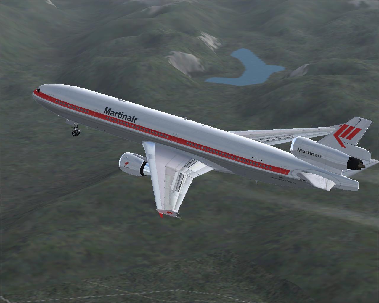
And other picture
Posted: 21 Mar 2007 12:40
by DeletedUser21
Wow! That just looks cool! I think they are both really fine!

Keep up the good work!
Posted: 21 Mar 2007 12:56
by ZxBiohazardZx
votes B
*request official lightning version of the planes*
Posted: 21 Mar 2007 12:58
by ZxBiohazardZx
Wacki wrote:And other picture
for this one id say pic both, A= KLM (dutch biggest) B could be martinair or whatever,
Screen 1
Screen 2
edit by Born Acorn: Made large image link.
Posted: 21 Mar 2007 14:11
by Need_Help
I vote for B, but change a bit. I think you can make a 'logo' just like the real one on the place as shown as the picture before my post. Maybe a round 'dot' and the company colour. Another problem is, the 'head' should be smoother, this is too 'sharp'. The wings should be larger, because the engine behind there is a lot bigger, and its too long, which makes it not realistic. You should use a reference image when you model it, to make it looks real

(not just looking at it, but following exactly what is the scale of the plane)
Thanks
Posted: 21 Mar 2007 14:36
by Wacki
Need_Help wrote:I vote for B, but change a bit. I think you can make a 'logo' just like the real one on the place as shown as the picture before my post. Maybe a round 'dot' and the company colour. Another problem is, the 'head' should be smoother, this is too 'sharp'. The wings should be larger, because the engine behind there is a lot bigger, and its too long, which makes it not realistic. You should use a reference image when you model it, to make it looks real
(not just looking at it, but following exactly what is the scale of the plane)
Thanks
Which model you meaned? S_U52 or BL_LB80? I made both of them according to blueprints!!! So models and sizes are realistic!!!!!!!!!!

Posted: 21 Mar 2007 14:42
by Wacki
I try made (so far it is uncomplete) Kelling K1, so you can write your suggestions
Posted: 21 Mar 2007 14:44
by DeletedUser21
That looks very awesome!
Kudo's to you mate!
1 thing: How would it look like to make the Engines underneath the wing a bit bigger?
(While I always had the idea of the Kelling K1 looks a bit retro, this new graphic changed my way of looking at it. It's quite a futuristic plane this way!
WOW!)
Posted: 21 Mar 2007 16:20
by Sleepie
I vote for B for both planes. Really awesome artwork
Posted: 21 Mar 2007 16:50
by ZxBiohazardZx
found new inspiration:

that is a new building for a small-track (700mm) steam-engine depot, near my own house.... ill try to add some details of it to my work, hope i can find more drawings:)
Posted: 21 Mar 2007 18:18
by PikkaBird
Jupix wrote:Sorry I don't know the correct terminology.
Tail fin (the horizontal parts are the tailplane or horizontal stabilizer).
That's a fair go at the Kelling K1. But do the new graphics really need to replicate all the original silly futuristic aircraft?
Posted: 21 Mar 2007 18:43
by Born Acorn
Doods, please don't stretch the table! Generally if your picture is so wide, make it a link, thank you.
Posted: 21 Mar 2007 20:35
by Sergej_S
Wacki wrote:Model is complete, but I use unofficial light setup. Which picture is better?
I very much liked variant B
Sergej
Posted: 21 Mar 2007 20:39
by Sergej_S
Wacki wrote:And other picture
I very much liked variant B
Sergej
Posted: 21 Mar 2007 21:04
by Ben_Robbins_
Well I've reached quite a big hurdle. Railway track lining up; here’s the problem with illustrations.
A) If I want to get all the rail tiles to line up I have to have the diagonal tiles very thin. If I make the diagonal the same thickness then the 2 don't line up. This problem is so because the joining angle of any 2 sides should be the average of the adjacent angle to the 2 interconnecting rail pieces, but in TT it is fixed along the tile edge.
B) If I then set the corner to be at this average point then they line up but...
C) Then it doesn't work for diagonal to diagonal in the same direction. I then thought of a solution, and it was to have the near side of each tiles rails come off the till and curve inwards as in E, but
D) When a Straight level rail piece is put on square 2 it renders later. I'm not shroe why, because both tiles 2 and 3 both have a rocky embankment sprite included, but 3 does not render late, while 2 does.
E) the consequence is that the curved in ends are exposed at the edge of tile 2.
Now what’s the solution? Should I just make diagonal rails thin and look odd? or is there a way to…
1) Stop these tiles (there’s a few situations) rendering late, as they don't need to because the Stony Embankment doesn't over lap the tile, or
2) Is there a way to attach a mask which can be used on the problem tiles and remove the end bit, or
3) Just make more variations of tiles so this problem doesn’t occur at all. (If this, then I would suggest that tiles should still be added in exactly the same way, but if x is next to y then tile z sorta thing should make them display the appropriate tile. There would be many many combinations though.
Posted: 21 Mar 2007 21:20
by Born Acorn
For now, at least, it should just do it exactly the same way OTTD does it, which is to have thin vertical and horizontal tracks. (which are the ones which bridges and stations don't yet support).
Whenever the support for curved bends comes in, that system can be easily adopted.
Posted: 22 Mar 2007 00:55
by mexicoshanty
Yeah i think just for the time being just do it the way it's done now, so solution A.
Posted: 22 Mar 2007 07:26
by brupje
I agree.
Nice tracks btw
Posted: 22 Mar 2007 10:33
by Wacki
Which is better?