Page 126 of 313
Posted: 09 Jan 2007 07:29
by brupje
Heathen wrote:
Well done

Only the grass is missing, you can create it by using particles and the official_meterials.
Posted: 09 Jan 2007 19:49
by Heathen
I tried the official materials, there is a grass_ground and a grass_halmes I think. I've opened that file, and didnt understand how to actually get the grass "effect".
I'll experiment now and see what I come up with.
re:
Managed to get grass in the scene, though it looks a little to big to me
Added the inner window frames (forgot them fancy words!) and lower sills, added a wall texture, re-made the large dome. Still cant think of anything for the other side of the roof, maybe another skylight?
-Hmm seems one of my dome sticky outy bits has rendered wierd, that'll because there is 2 there. doh'
Posted: 09 Jan 2007 21:46
by brupje
Heathen wrote:I tried the official materials, there is a grass_ground and a grass_halmes I think. I've opened that file, and didnt understand how to actually get the grass "effect".
I'll experiment now and see what I come up with.
re:
my grass comes out an almost luminous green :S
you will have to use partcles

Posted: 10 Jan 2007 03:43
by athanasios
I love the texture on the walls. It is number one!
I prefer the original roof tiles, but make them darker.
REASONS:
1 Grey is good for pavement.
2. In real buildings insulation top is usually tar (like last roof top of bank) and a finished job has tiles on top of the tar.
Try to use a different color for the beams of the dome, to make them stand out. I would also shift the tint to a warmer yellow (= towards red). But be cautious, do not make it copper, it should be gold.
Pillars on entrance could be more thick, and entrance area bigger.
Also windows are long and look like doors. Cut them under >
Use a different (darker) texture (maybe resembling stones) for lower part of walls (under windows).
Posted: 10 Jan 2007 09:44
by Alinator
Hi Heathen,
i tried to do the bank too, but my full-time "Zivildienst" stopped this project for a while. Maybe you can use some of my details (textures, flowers etc.)
Im still interested. Mail me if i can help you with small items.
The first file is a smaller older version, the 2nd is bigger with new lighting setup.
Posted: 10 Jan 2007 16:43
by SSX
Heathen wrote:Still cant think of anything for the other side of the roof, maybe another skylight?
Maybe an A/C unit? I don't know.
For the age of this building, I think the skylight could use two more vertical mullions. The panes are still a bit large.
I agree that the roof should be darker.
The front columns still could use capitals and bases.
Take a look at this, if you don't get what I mean:

Other than those small things, it looks amazing.
Posted: 11 Jan 2007 00:15
by Ben_Robbins_
I've returned after sitting in a treehouse for a week or so. Now back to modelling.
brupje: I like your building, but I wouldnt think it is a replacement for the building you linked it to in the project revaval post. Have you done anymore on it after you last post?
Heathen: Hi,...The bank is good, although isnt this the banks 3rd appearance?. Anyway, it looks cool, but I feal like the other goes at modelling it, it seems to be quite yellow, and lacks the shiny white colours simlar to the attached image of the column above. Although in your last render the yellow is less than before, I still think it lacks the bright shiny, maybe reflective, white stone effect. Otherwise you last attched image is very good.
ps. a minor note, the pavement on the bank is rather thick. We need to standadise the pavement hiegth really, but usually its about 1/3 of the hieght you have it at.
Posted: 11 Jan 2007 07:37
by brupje
Ben_Robbins_ wrote:
brupje: I like your building, but I wouldnt think it is a replacement for the building you linked it to in the project revaval post. Have you done anymore on it after you last post?
Why wouldn't it be? I had little time to model, but played with a texture for the doghousebasementthingy.
Posted: 11 Jan 2007 11:47
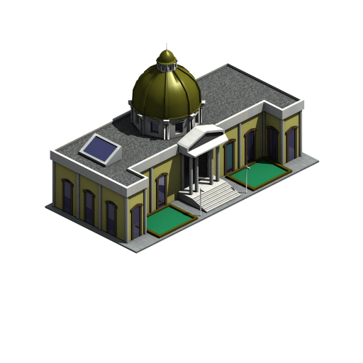
by Heathen
Hey Alinator, I got your larger one into blender but when I attempted to render it, Blender crashed

I'll try the 1st one. Thanks for the help

Changes:
Added bases/tops to the columns, though the tops are hard to see.
Changed dome colour slightly
Brightened the whites (used Daz)
Added small light sources from the lamp-posts
Added some AC unit bits and bobs
Dome slight colour change
Attempting new roof texture.
Moved windows up off the floor, and made the lower wall a different material
Added more mullets (

) to the skylight
I am currently trying to figure out how to darken the pavement tiles texture for the roof, without it darkening the one used on the floor, any pointers?
Image:
Posted: 11 Jan 2007 15:57
by Ben_Robbins_
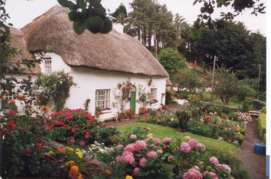
Brumpje, The house you have made looks like a modern, largish house built in somewhere like Austria. The original looks like a set of small workers cottages, with thatched roof, and rouge painted white stones making up the walls. The legth of these buildings is usually many times the depth of the building. e.g. 50' by 12' / 16m by 4m. The upstairs windows then sit with in the thatch, so the buildings are low to the ground, although the victorians built them much taller. The new forest is an example of where there found.
Examples:
http://www.stradbally.com/files/covecottage1.jpg
http://www1.istockphoto.com/file_thumbv ... tage_3.jpg
http://www.irelandnorthwest.ie/images/A ... 128001.jpg
I don't mean to insult your building!, I think its rather good, but I think the few differences between it and the one you said its based on are the key features that make it what it is. Therefore I thourght it was a completly new building all together.
Posted: 11 Jan 2007 20:52
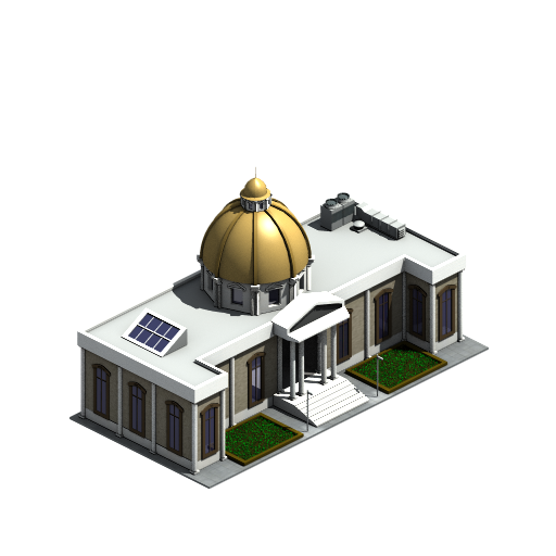
by SSX
Heathen wrote: *snip*
Awesome! I see you even added bases to the engaged pillasters (sorry for my technical architecture terms) I can't think of anything to change once you get the roof texture sorted out.
All these great buildings showing up here. I think I might do one in Autodesk VIZ 2007. I would assume I could get it into blender when it's done.
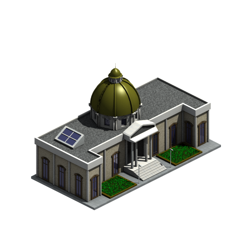
Posted: 12 Jan 2007 03:19
by athanasios
Heathen: Very nice colored Dome and nice additions and ... - thats what I meant in my post.
When darkening roof do not neglect to darken and surrounding "white" - it is very bright.
An idea: Might it be better for the walls of the dome to have same color - texture with rest walls of building instead of white? Give it a try please to compare.
Entrance modification? Entrance pillars thicker?
Posted: 12 Jan 2007 06:39
by SSX
I think if the pillars are made thicker, it starts to look like a single story building again. Feel free to prove me wrong though, if you wish.
Posted: 12 Jan 2007 21:22
by Mr. Wednesday
I think the front-extending wings on either side look a little narrow. It would cut into the lawns, but it might look better if the wings begin after one window instead of after two.
I'm thinking then the front looks something like this:
Code: Select all
+       +-W-+EEEEEE+
|       |
W       W
|       |
+-W-+-W-+
(appropriately mirrored around the entrance)
Posted: 13 Jan 2007 03:53
by athanasios
I do not think two windows on each wing would be nice. One, but with a few more pixels of wall, on both sides of the window.
Posted: 13 Jan 2007 09:22
by Grolsch
I like these stairs:
Heathen wrote:
much more than these:
Heathen wrote:
furthemore in the new bank:
windows higher is better
roof thinghies is better
roof texture is worse
golden sphere thing is better
different material under windows is better
All is ofcourse my humble opinion, no harm ment
Posted: 14 Jan 2007 03:05
by athanasios
So we have to keep the good parts from both.
Combination-cooperation in drawing is a good idea. It brough good results here. I wish same will happen in future graphics too, than arguing about this or that. We suggest, we try, and then combine what is good, having a nice result in total.
Posted: 19 Jan 2007 12:43
by brupje
Updated, without shadows
Posted: 19 Jan 2007 16:46
by XeryusTC
There is grass behind the windows!
Posted: 19 Jan 2007 17:45
by brupje
or that, or reflection