Page 7 of 9
Posted: 26 Apr 2007 17:38
by m3henry
^^^
look up/last page
ive als had a hue change on the origional GUI!
Posted: 26 Apr 2007 18:39
by Ameecher
I like the grey arrows and the blue menus.
Posted: 26 Apr 2007 18:59
by bob27
all of the gui looks pretty professional, but the only thing that gets me is that the cursors look a bit too big
Posted: 29 Apr 2007 12:56
by SHADOW-XIII
m3henry's GUI looks great but it might require alpha channel touch to get rid of pixels around small buttons (the most visible part of pixels)
as for cursor we need something about standard Windows-size cursor.
EDIT: like this first white arrow top left ? (resized image)
Posted: 30 Apr 2007 18:56
by m3henry
hmmm???
Posted: 01 May 2007 10:31
by DeMoraatz
wow man, it looks awesome!!
Posted: 01 May 2007 16:34
by uzurpator
Purno - since you are the interface guy - what is your decision?
Posted: 14 Jun 2007 17:23
by bob27
A couple of things.
1.I took Purno's first and m3henry's Gui design and added a little to it.
2.Please tell me if it looks good.
3.@Purno What font did you use?
4.I'm not sure about anyone else but I think Purno's first design was better than the others. Anyone agree?
Posted: 14 Jun 2007 17:35
by Purno
bob27 wrote:1.I took Purno's first and m3henry's Gui design and added a little to it.
Nice.
[quote[2.Please tell me if it looks good.[/quote]
It does.
3.@Purno What font did you use?
My own handdrawn pixel font.
4.I'm not sure about anyone else but I think Purno's first design was better than the others. Anyone agree?
It does indeed look nice, but perhaps a bit defaultish. It's good though. (That doesn't mean the new metal GUI was bad).
Posted: 14 Jun 2007 17:44
by bob27
My own handdrawn pixel font.
It does indeed look nice, but perhaps a bit defaultish. It's good though. (That doesn't mean the new metal GUI was bad).
1.That's funny I kind of guessed it was hand done (look at the letters I attepted to do, mine are horible.)
2.I see what you mean by "defaultish." Its just that the first one looks slightly better that the metal IMHO.
3.But it's your decision (Becuase your the pro here

) so do carry on.

Posted: 14 Jun 2007 18:10
by Purno
It's very fine you have continued this first GUI

Posted: 25 Jun 2007 15:31
by bob27
I've been thinking, maybe Purno's metal gui would look a little better if the close button, outline and scroll bars were a bit thinner?
Posted: 25 Jun 2007 15:46
by Purno
Possibly, but tiny buttons are annoying, as you misclick them easily.
Posted: 25 Jun 2007 16:00
by bob27
Maybe not too much smaller but maybe like this?
1st button is original-2nd is smaller version
Re: [media] Technical content of TE
Posted: 15 Sep 2007 21:23
by m3henry
it would be nice if you could customly select wide, normal or narrow versions of the metal GUI title bar, slider and close button, for personal preferences.
Bob27's smaller one could be the normal sized one, that I like a lot.
on the subject of cursors, I think a small cursor in the size of the windows cursor would look nice for sleek, but what colours should I use?
My suggestion for tempire gui
Posted: 18 Sep 2007 22:48
by ohlidalp
Hello everybody.
My suggestion for TE GUI:
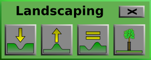
- terraformingPanel.png (14.54 KiB) Viewed 19131 times

It is SVG made with inkscape (my first SVG image
). Plain, quick and simple, but good enough and ready for use, i think.
It appears there is nobody here with 2D graphics skills (I mean other than pixelart) and so it would be a good idea to decide for some simple design, such as i did.
As i said, its my first svg graphic, i have very little skills wit graphics so dont expect me to do something much better
...
Tell me what you think about it.
PS:
uzurpator wrote:...
Icons:
Terrain manipulation interface
needed
Hope this helps

Re: [media] Technical content of TE
Posted: 19 Sep 2007 10:38
by Hyronymus
They look sharp
. Me like.
Re: [media] Technical content of TE
Posted: 19 Sep 2007 11:14
by Expresso
Why not make the button icons in svg format, that way they could be resized by the user (if/when Transport Empire implements resizing of its widgets).
Re: [media] Technical content of TE
Posted: 19 Sep 2007 16:13
by uzurpator
An00bis
Could you post your icons in a more edible format, with 1 icon/file with just icon, no background button?
Take a look at "/media/gui/hammer.tga" to see what I need.
Icons
Posted: 19 Sep 2007 18:52
by ohlidalp
uzurpator wrote:...post your icons in a more edible format...
Not sure what that means, but since svg is the best vector format, you probably mean bitmaps.
The attached zip contains 5 icons (I added lomo-like adjustment tool), each in svg and png[100X100px, RGBA] format. All images have transparent background, no button.